Epistemix
Visually communicating complex science
in a clear and captivating way.
As the only designer, I was responsible for creating all things visual—from web design and development to custom typefaces; from UI/UX to illustration and animation; from printed brochures to interactive data visualizations. Everything but the logo (for reasons described below).
Born from decades of research, Epistemix’s core product is a software that simulates population behavior. That behavior determines how an idea or disease spreads, based on countless interdependent factors.
During the COVID-19 pandemic, Epistemix applied their groundbreaking science and technology toward helping governments, companies, schools, and conferences navigate the uncertainty. As the pandemic waned, Epistemix increasingly focused on marketing their product to data scientists.
Important work deserves a compelling presentation.
Below is a small selection of the work I produced during our 2-year partnership.
The homepage showcased elements from 2 years of projects: from the typography, to the data visualizations, to the product UI shown in the laptop.
Not everything needed to look science-y or serious. I created abstract artwork for each of the timeless thought pieces and case studies on their blog.

The majority of the company’s work requires layering complex information on a map. Our projects were a crash course in data visualization—and I loved the fusion of storytelling, art, coding, and user experience design.

A data visualization showing the beginning of COVID-19 in New York City. Epistemix’s software can simulate pandemics and help leaders evaluate different strategies. It was vital to present that data in a clear and compelling way.
A custom map theme, fine-tuned to the company’s needs.
As the team grew, I created a toolkit of data visualization design guidelines and a custom map theme for all to use.
Overnight, it looked like a designer was involved in everything they made!


A more illustrative data visualization for a social media campaign about helping the events industry navigate the pandemic.
One of the joys of working with a client on many projects is discovering the threads that run through everything we create—from immersive web pages to small icons.
We can then define design standards that are deeply practical and enthusiastically adopted by the team.

A portion of the custom icon set used throughout presentations, websites, and user interfaces.

Product images for the company’s various offerings—from custom dashboards, to consultations, to cloud compute credits.
As the company’s sole designer, I was responsible for both expressive and utilitarian projects. A prime example of the latter, I designed and standardized user interfaces for client dashboards and the company’s own software product.
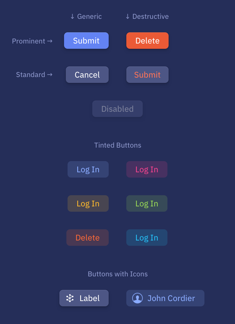
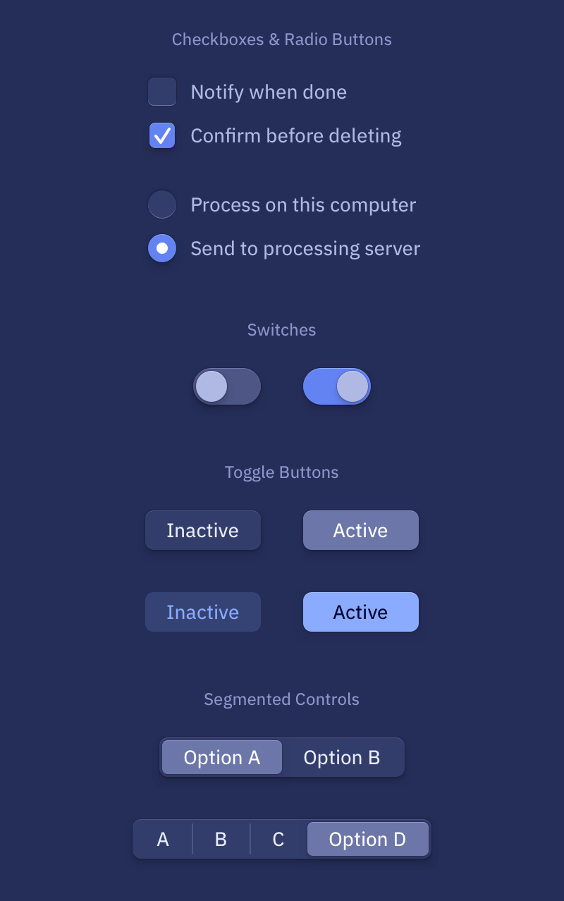
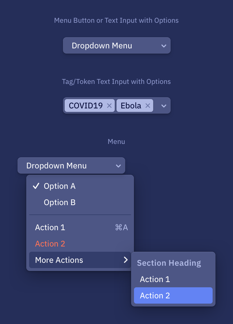
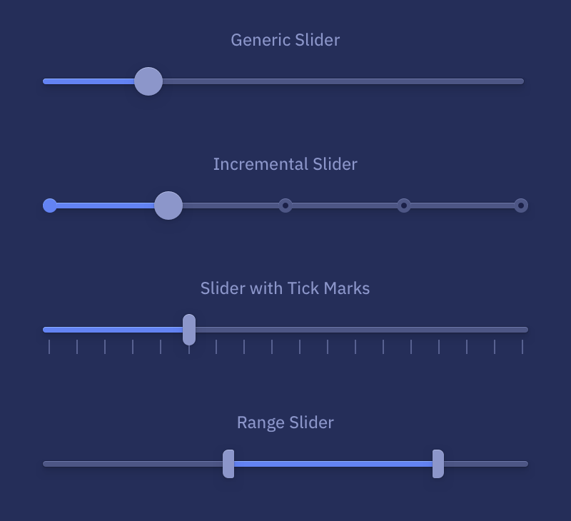
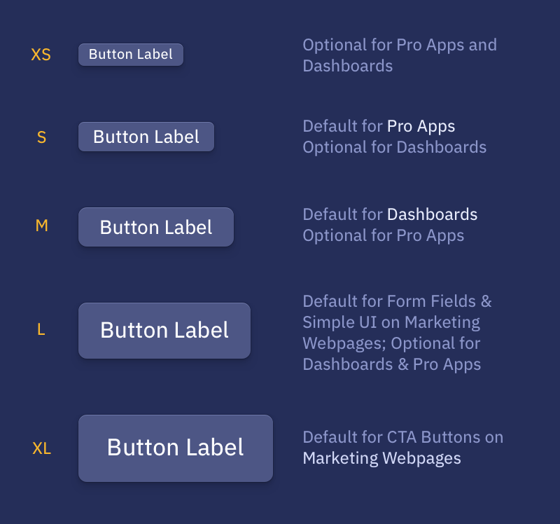
A selection of buttons and controls from the UI toolkit I created.
The UI standards and toolkit made an immediate difference—suddenly Epistemix’s product, website, dashboards, software IDEs, and interactive data visualizations felt cohesive and easier to use.

The custom typography, UI, maps, and syntax-highlighted code theme converged in the company’s interactive documentation.

A cover page template for documents and reports, with dozens of background artworks to choose from.
Looking back on where we started… their website before I began:

The website before I began working with them.
I believe that a designer’s role is just as much about creating as it is about questioning whether to create something.
Epistemix initially approached me to redesign their logo and website, but after evaluating their time and budget constraints I recommended keeping the logotype and building a new visual style around it. This alternate approach allowed us to focus on immediately impactful projects like their website, presentations, and product—allowing the young company to book more investors and clients.

Before

After
Interested in working together on a project?