Typefaces
Works in progress
Typography has been a core focus in my design work for many years, and I’ve recently been designing a few of my own typefaces—including Cantilever and Napoléon, shown below.
Each of these font families is a currently a work in progress, and will be published in the future. In the meantime, if you’re interested in licensing one of them for a project, feel free to get in touch.
Cantilever Sans
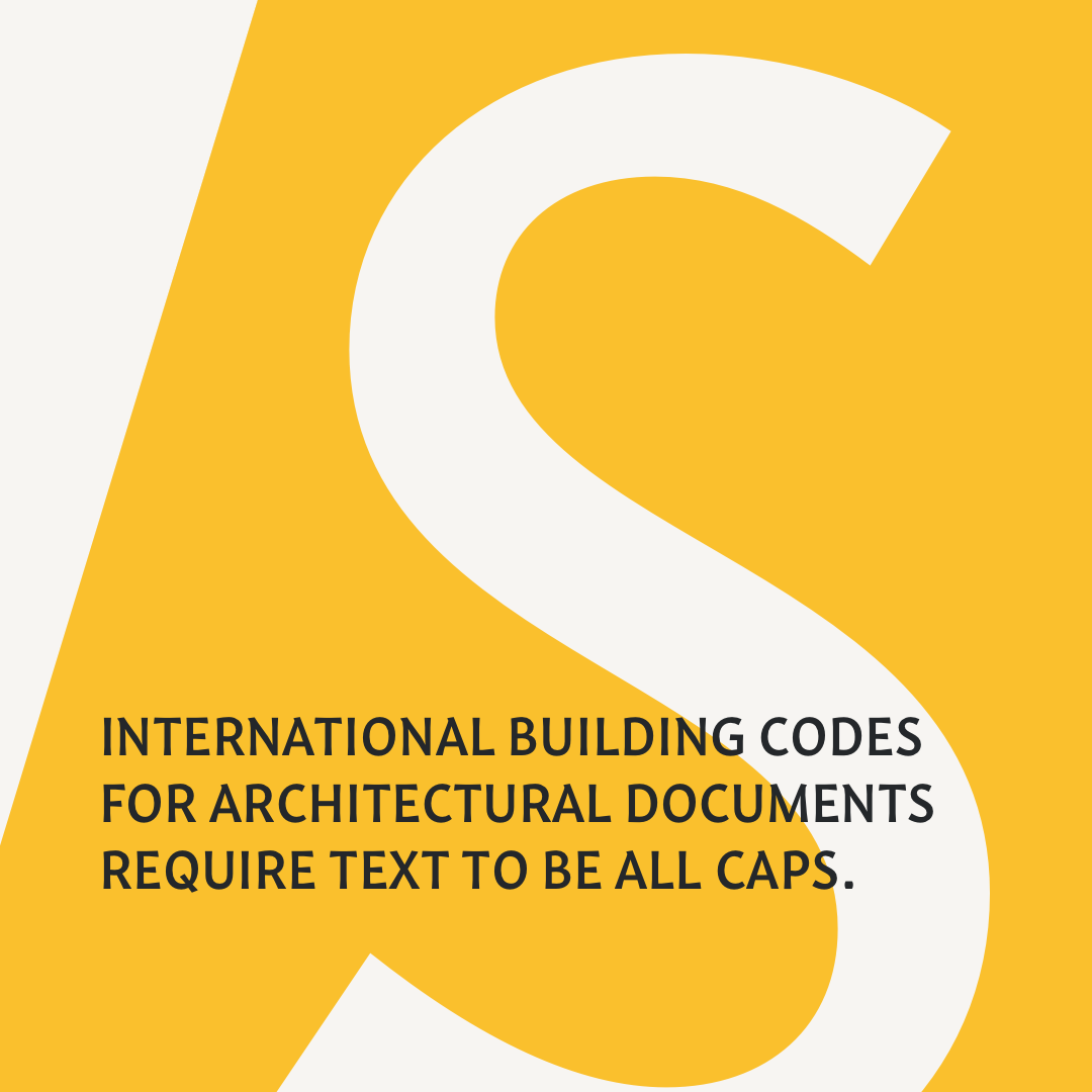
Designed to meet the unique needs of architectural, design, and engineering documents, Cantilever prioritizes clarity. It was my main project during the Type@Cooper post-graduate program.


Cantilever Mono
A monospaced companion to Cantilever Sans, bringing the same focus on legibility to your code editor or manuscript. While many fixed-width fonts relish a mechanical style, Cantilever Mono retains an organic, calligraphic character that our eyes are accustomed to reading from books.


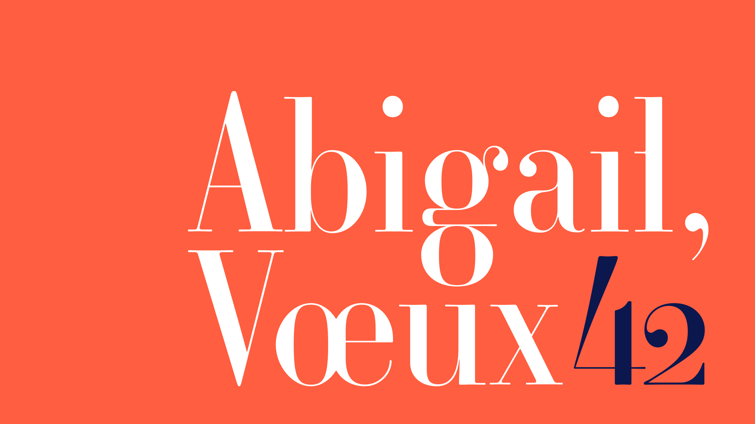
Napoléon
Napoléon is a digital revival of a royal French typeface from the mid-1800s. Originally punch-cut by Marcellin Legrand at the French Imperial Printer, the typeface was primarily designed for small text sizes in books, although I’ve adapted a range of optical sizes from 10pt to a 200pt hairline for massive sizes.


In late 2021, Napoléon received the Updike Prize!
The Updike Prize is awarded every other year to a student typeface that leverages material from the Updike Collection’s vast typographic archive in Providence, RI.
Watch my 12-minute presentation about the story behind making Napoléon, starting 6 minutes and 40 seconds into this video from the award ceremony.
Skip to the 6:40 mark to see the story behind making Napoléon.