Introducing Font Proofer

I just launched my big new project! Font Proofer is a Mac app to help typeface designers test their work-in-progress fonts. This testing, or “proofing,” process is essential in the production of every professional font, but it’s immensely tedious with conventional tools. So I set out to fix that.

Design Tool

It began while I was studying typeface design in New York City, at the Cooper Union’s yearlong postgraduate program. While creating two typefaces, I learned about the vital process of making “proof” documents to stress-test a font in a variety of contexts.

Unfortunately, creating, editing, and reusing a font proof is a pain in the neck. It’s slow, error prone, and often dependent on brittle Python scripts that someone hacked together years ago. After wasting countless hours, I began to imagine how to automate it. 

I was immediately captivated by the possibilities of such a tool, and I tinkered on it constantly as a form of procrastination! But I had a hunch it could become a product. After demoing a prototype at TypeLab (part of the annual Typographics conference), the response was electrifying. I decided to commit and take the shot!

I learned two programming languages and applied my decade of experience designing user interfaces, brand identities, websites, typefaces, and training materials. This fusion of my different skills while learning new ones has been invigorating. Mix in the enthusiasm from type designers: rocket fuel.

For the past year I’ve been rapidly iterating Font Proofer with input from a small group of top type designers and foundries. Not as a free beta that everyone forgets about, but a paid program with close communication. I can’t recommend this approach highly enough to other creators! There’s no better way to validate a concept and identify priorities for a product.

While Font Proofer is a textbook case of addressing un-met needs, the biggest challenge will be making this project sustainable. The type design industry is small, and too many font production tools end up abandoned. So I’m trying new things: from Font Proofer’s technical foundations to its subscription pricing model. It’s an experiment in the smallest viable audience.

Most people on this newsletter are creative professionals but probably not type designers. For you, I’ll continue sharing what I learn on this journey. If you are a type designer, go get yourself a free trial of Font Proofer and check out the tutorials!

I can’t wait to hear what you think!

End of an Era

Sketch Master Sunset

After nearly 6 years of training thousands of designers around the world, Sketch Master will stop accepting new enrollments next week and will begin a gradual process of shutting down. Existing students will continue to have access to the courses for a while, and this page provides all the details about the transition.

As a member of my newsletter, I want to make sure you’re the first to hear this news. I’m keeping enrollments open for one more week, for any of you who want the chance to take the courses before they vanish from the internet forever.

If you’ve been considering taking a Sketch Master course, now is the last chance. Sales will close a week from tomorrow, on April 18.

It’s challenging, humbling, and emotional to shut down a project I’ve poured so much of myself into. More than anything, I’m sad to let go of something that has facilitated so many connections to other creatives and life-long learners. From students in Singapore, web developers in Poland, illustrators in Colombia, design directors in Australia, and even Sketch’s own team members, I’ve been touched by the heartfelt stories from each person who emailed me about how much the training meant to them. I will miss seeing these in my inbox. The sadness is mixed with profound gratitude.

The announcement shares the reasons behind this big decision, and I plan to publish a more in-depth retrospective in the coming weeks. To those of you who have shared this journey with me, I cannot thank you enough.

The future is bright! If Sketch Master resonated with you, I think you’ll appreciate the projects I work on next. I’ve been designing my own typefaces, building a tool that allows type designers to better test their fonts, leading live virtual workshops about niche topics like Python Scripting for Type Design, and slowly gathering material for a book, workshop, or online course series about icon design. I also plan to publish more articles about design, creativity, and learning.

This newsletter remains the best way to stay in the loop about what’s coming. Oh, and if you want to share anything about what Sketch Master means to you or what it’s helped you achieve, I’d love to hear from you.

With gratitude,

Peter

True Blue: A Special Design & Art Project

Every so often, I get the chance to work on a design project that fills me with so much enthusiasm it affirms why I do what I do.

For the past two years I’ve been collaborating with novelist and close friend Eliot Peper and illustrator Phoebe Morris on a genre-defying public art project called True Blue. We just launched it!

True Blue adapts a short story of Eliot’s into a visual experience—fusing meticulous graphic design with charcoal and watercolor illustrations—all tailor-made to live online and be free for everyone.

My role on the project has gone beyond graphic and web design; I’ve been the art director, the image retoucher, the lettering artist, and the engineer. We’ve tried to use every element to advance the narrative, which has lead us to innovate throughout the creative process. Eliot wrote a brilliant article about it:

One of the most exciting design details is how we’ve adapted the illustrations for different screen sizes and aspect ratios—not simply by cropping them, but by actually changing the composition and contents of certain illustrations at different sizes. The imagery adapts to enhance and add meaning to the story—no matter what device you’re experiencing it on. We’re calling this Narrative Responsive Design.

To engineer all this, I leveraged some rarely-used techniques for responsive images, and pushed them way further by building a custom tool. I plan to open-source that tool and write an article about it soon!

And at some point I’ll have to write an article or course about implementing advanced graphic design on the web, because I’ve been learning so much from this project and last year’s French Press Films website. Digital design—especially on the web—really deserves the same artistic diversity as print graphic design from the last 100+ years.

Both artistically and technically, True Blue is my best work.

Here’s the link to True Blue and to the making-of article. I invite you to check them out, and—as always—I would love to hear what you think!

Announcing Certificates from Sketch Master

As 2018 comes to a close, I have one last announcement! Today—after tons of requests and feedback—we’re launching certificates for all Sketch Master students.


What connects you and I is a shared passion to master our craft and our tools. That’s what drove me to create Sketch Master; empowering creatives like you with new skills to make things you’re proud of.

Investing in yourself is an important part of any creative career, and I want to help you demonstrate that to the outside world. To your boss, your peers, or a prospective employer.

A Sketch Master certificate communicates that.

 
SM Certificate Screenshot 4.png
 

Each certificate has its own special webpage, and can easily be printed out, shared on your website or social media, or added your LinkedIn profile.

Thank you to all the students whose feedback and suggestions inspired this addition to Sketch Master. People like you inspire me every day, and I’m always looking to empower you with new skills or (in the case of certificates) with ways to showcase your existing skills.

New UX Design in Sketch Course

Today I’m so excited to release the 2018 edition of my online course User Experience Design in Sketch—a comprehensive rewrite and rerecording of the original.

The new course covers exciting new workflows that harness Sketch’s newest features—including Data, Libraries, and Prototyping. If you haven’t heard about Data, that’s because Sketch just released it today, as part of their huge version 52 update! I’ve made the whole lesson about Data available as a free preview, so check it out here.

The new course also contains hundreds of improvements based on student feedback, covers both Android and iOS workflows, and packs an additional hour and a half of design techniques.
Check out the list of what’s new!

All students who previously purchased this course have already received the update for free.

Despite becoming the biggest course on Sketch Master, I’ve decided to keep the price at $49 for the next few weeks. If you’re considering signing up for it, there won’t be a better time.

I’m committed to keeping these courses up to date with the latest features in Sketch, the best design workflows, and the improvements that students have suggested. Let me know what you think of the updates!

New Edition of My Sketch Beginner Course

Two years ago, I launched Sketch Master with two courses: Getting Started with Sketch and User Experience Design in Sketch. Since then I’ve received feedback from countless students, about what they loved and what they’d love to see added.

Today I’m releasing a new edition of the Getting Started course that listens to that feedback, incorporating hundreds of improvements both big and small.

Check out what’s new!

I’m committed to keeping these courses up to date with the latest features in Sketch, the best design workflows, and the improvements that students have suggested.

All students who previously purchased this course have already received the update for free!

The Closest Solution to Hyperlinks in a Sketch Project

On a recent design project, I discovered a super easy trick to navigate huge Sketch documents more efficiently. It uses Symbols to create what are essentially hyperlinks to the most important areas of your project.

The implications are so exciting (hint: a hyperlinked table of contents for your Sketch document), and it doesn’t require your projects to be organized a certain way—or at all! I’ve also made a Sketch file available as a demo and template to get you started.

Here’s to a faster workflow!

Insights from an Unconventional Creative Project

I recently finished a massive design project for French Press Films, completely redoing their brand identity and website. Early in the process, we were inspired by iconic posters and jazz albums from the 1930-50s, and envisioned a website made out of cut-out paper and basic printing—a digital product seemingly made with pre-digital tools. So even though the final deliverable was a website, the creative process bore little resemblance to a typical web design project.

Of course, embarking on an uncharted creative process can affect everything from visual design, to engineering, to billing—but it’s so worth it. This article shares how I navigated those uncertainties, and insights that you can use in your own projects.

Stuff at the Top of an SVG

In preparation for the upcoming course SVG Workflows in Sketch, I’m wrapping up a few resources about specific topics surrounding Sketch and SVG. One of them is a new article I just published, explaining all of the mysterious code at the top of SVG files, and when it’s safe to get rid of it.

Although this is a technical topic, the article is intended to be practical and understandable for designers who don’t know how to code; an easy guide about which things you need and which you don’t. If you’re still unfamiliar with the basics of SVG code, don’t worry—I’ve got a couple sections in the course that make it easy to learn.

I wish I had resources like this when I was learning SVG, so I’m determined to provide some of those missing pieces for other designers like you.

Introducing SVGito

Remember that SVG optimizer I mentioned a few weeks ago?
It’s out! And it’s called SVGito.

SVGito is a web-app with new optimizations for your SVG files—especially those exported from Sketch.

It automates a few improvements to SVGs that you would normally have to do by manually editing the code—including an optimization for cleaning up Sketch’s extra inside/outside border markup, which I mentioned recently.

You can learn all about the tool and its optimizations in today’s release article.

I realized that SVGito was a tool that had to be made while working on my upcoming SVG course. Rather than wait until the course is finished, I’ve decided to release SVGito now. It’s publicly available and free to use. If you don’t quite understand what the heck an SVG optimizer is, you can start by reading this article about how to think about SVG. The course will dive even deeper. Happy optimizing, my fellow nerds!

Article: Sketch Borders in SVG

In the new version 43 update, Sketch quietly made a huge improvement to SVG export. I’m so excited about this that I’ve written a short article explaining how the new feature works, and why it will make your SVGs more reliable and smaller in file size.

For those of you who are familiar with SVG markup/code, the article also highlights something strange about how Sketch exports certain layers. This has inspired me to create a little SVG optimizer tool, to automatically clean up your SVGs for you.

Updates on SVGito & SVG Course

I’m almost finished with this optimizer, which will be available as a free web app from the Sketch Master website. It also includes a couple other optimizations that you won’t find in other tools, specifically aimed at cleaning up SVGs made in Sketch. I’ll send out an article and email when I release it next week.  
(UPDATE: The optimizer and article are now available; see above)

I’m releasing all of these SVG-related articles and tools leading up to the next Sketch Master course, SVG Workflows in Sketch

So when is that SVG course coming out?

I’m making great progress on it every week, and am just as excited as you are for the course’s release. These courses take time. Each one I make also inspires me to create new articles, tutorials, and resources surrounding the course topic; these become an important component of what you’ll learn and use in your daily workflows.

Rest assured that you will be the first to know when it’s about to be released. With that, it’s time for me to get back to work! :)

Article: Understanding SVG

It’s all about understanding SVG, especially from a designer’s perspective. The article covers everything from what’s possible with this unique graphics format, to how it impacts our workflows in Sketch or any other design tool. I know it will change the way you think about vector graphics, and excite you to explore SVG!

Upcoming Sketch Master SVG Course

Today I’m also announcing the next Sketch Master course, which will build upon the article with deeper and more practical lessons. I’ve found this to be a big topic, and want to share all of the related best practices and Sketch workflows that I’ve developed over the last few years of working with SVG. The course is about to enter post-production and is due to be released in March.

Podcast: Scaling a Side Project

Hacking UI: Podcast Interview

The HackingUI podcast recently interviewed me about my design work and how I turned my online courses (Sketch Master) from a side project into a business. We talk about how to manage your time when doing creative work, how to finish big projects, and why your personal goals are more important than creating a massively lucrative company.

Listen to the episode on their website or via iTunes.

Net Magazine Article: Typography in Sketch

Advanced Typography in Sketch

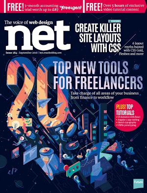
In case you missed it, I wrote an article in Net Magazine’s August-September issue about advanced techniques for creating beautiful typography in Sketch. The magazine is still available for a few dollars through their iOS app and Android Newsstand, so look for this cover:
 

Net Magazine Issue 284

I’ve also made all of the resources and examples from the article available for free on my website.

Awesome Typography Resources

Sketch Resizing Cheat Sheet

Sketch just released version 39 this morning, introducing a new flagship feature—symbol & group resizing. Check out their announcement article here... you may even recognize a familiar voice in the video!

Sketch 39 Resizing: Cheat Sheet

While making the video for Sketch, I uncovered every nuance of the new resizing features. There’s more to these 4 options than meets the eye, so I know you’ll find it useful to have this cheat sheet on hand.

Speaking Events & More

I’ll be speaking at a couple events in San Francisco this month:

General Assembly: Teach Me How to Freelance

This free panel discussion next Thursday (July 21) promises to be an interesting dialogue about navigating contracts, client relationships, and the tax implications of being a freelancer. I’m looking forward to sharing tips about client management and structuring your lifestyle and projects. Hope to see you there!

Mobile Interactive Prototyping (Event Series)

This series of evening events, from July 25 - 28, cover everything from prototyping tools (Sketch, Flinto, Adobe XD) to iOS design-development workflows. I’ll be speaking on the 28th about pixel density, and doing a Q&A afterwards. Tickets are cheap and available per-night or for the whole series.


What I’ve been working on...

A lot! I’ve written an article for Net Magazine about advanced typography techniques in Sketch. These 3 tips & tricks have never appeared in any tutorial before, so I’m excited to share the knowledge. The article will come out on August 11, in print and via their app.

Lastly, I’ve begun developing the next two courses for Sketch Master. Responsive Web Design in Sketch, and Advanced Typography in Sketch. Which topic are you most interested in?

Pixel Density Article & Video

Pixel Density, Demystified

What the heck do terms like “1x” and “DPI” mean, and what’s the difference between a “PT” and a “DIP”? These days designers need to have a solid grasp of pixel density in digital screens and how it affects their designs. I originally wrote this article as part of the UX course in Sketch Master, and now I’ve turned it into a fancy animated video too! 

In other news...

If you haven’t heard about Sketch’s shift to yearly licenses, be sure to read up. I also shared my thoughts in a short response. Some people found the time to complain about the change; meanwhile, professionals just nodded their heads and got back to work.

Introducing Sketch Master

Sketch Master was released to the public this morning! In case you aren’t up to speed, Sketch Master is a collection of training courses for professionals learning Sketch—the popular design tool. I’ve been working on this project for many months, and I’m so excited to finally share it with you.

Check out the courses and let me know what you think!