Font Proofer
App Design & Development
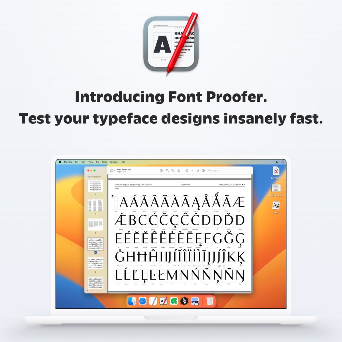
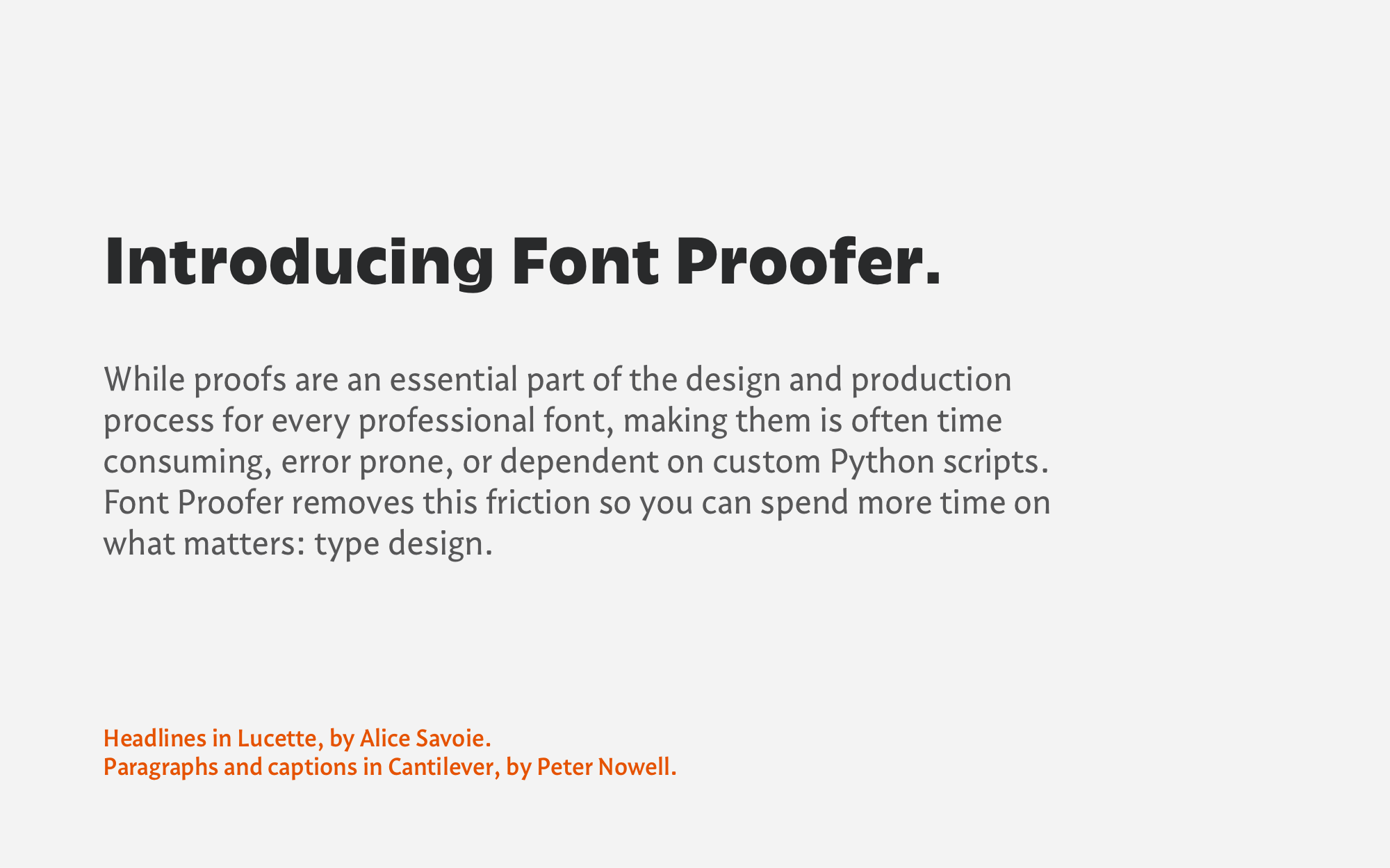
Font Proofer is a Mac app for typeface designers to test their work-in-progress fonts.
The tool addresses a decades-old unmet need across the type design industry. Launched in early 2023 after 3 years of development, Font Proofer is the first publicly-available, general-purpose tool of its kind.
I created everything. From the app’s UI and iconography to its software development; from the tutorials and learning resources to the branding; from the website design and development to the text typeface used throughout.
It’s a labor of love that leverages nearly all of my skills.
Skip to a section below:
Interface Design
Iconography
Software Development
Graphic & Web Design
Training & Resources
Interface Design
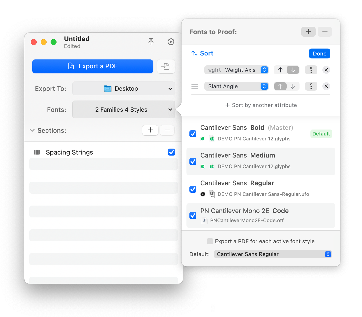
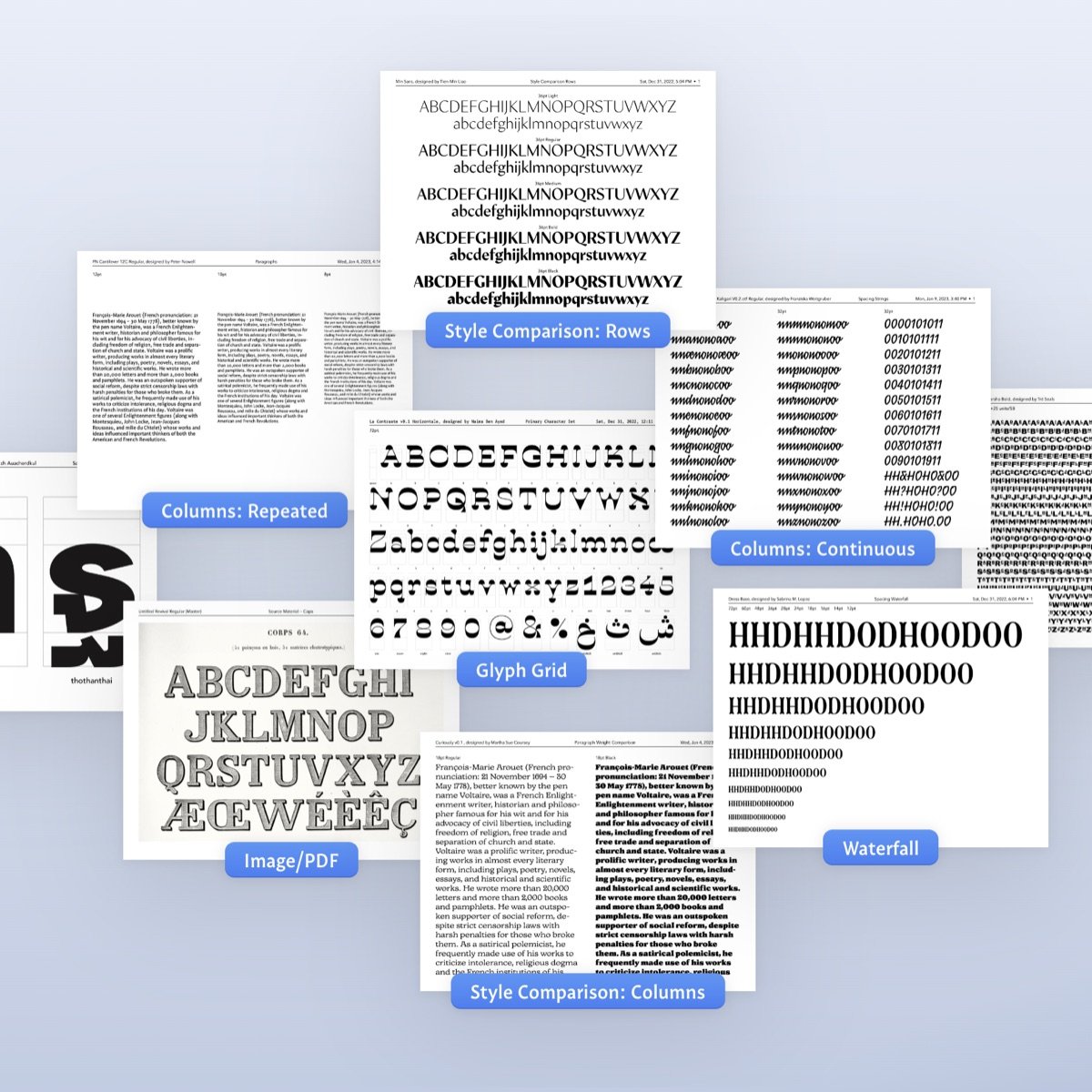
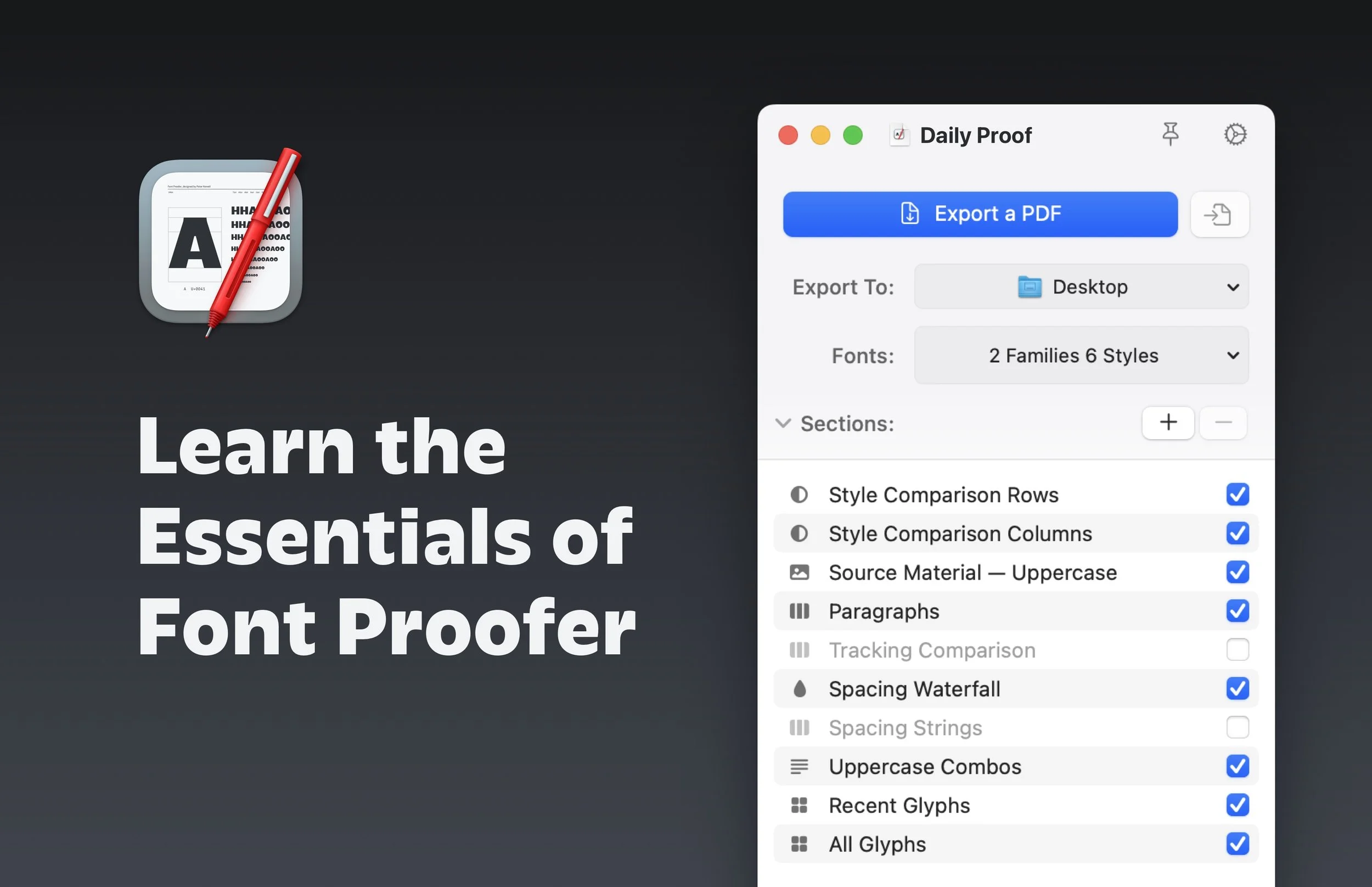
Font Proofer’s user interface is deceptively compact. Like a Swiss Army knife, additional functionality appears when you need it… to change the fonts or customize a page layout.
The app aims to address decades-old unmet needs in a way that feels familiar. This isn’t the place for novelty. Font Proofer intentionally uses standard macOS UI elements.
Creating a new proof document begins by choosing one or more font styles. You can even choose from projects that are open in a separate app, like Glyphs.
The app uses animation sparingly and purposefully—showing the continuity of elements or information when the UI changes.
In the example above, when creating a new document the user is presented with a preliminary interface to choose which font to test. Then, while the window transitions to the main interface, the chosen font moves fluidly to its new position. That animation helps the user instinctively know where to access their chosen fonts.
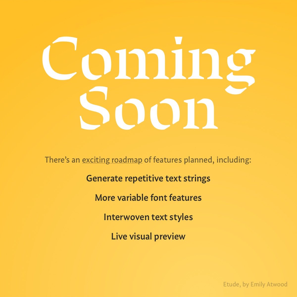
One of the “North Star” goals for the project is to add a live visual preview of a proof document, rather than exclusively exporting PDFs. This will enable new use cases for Font Proofer, and my prototypes are promising.
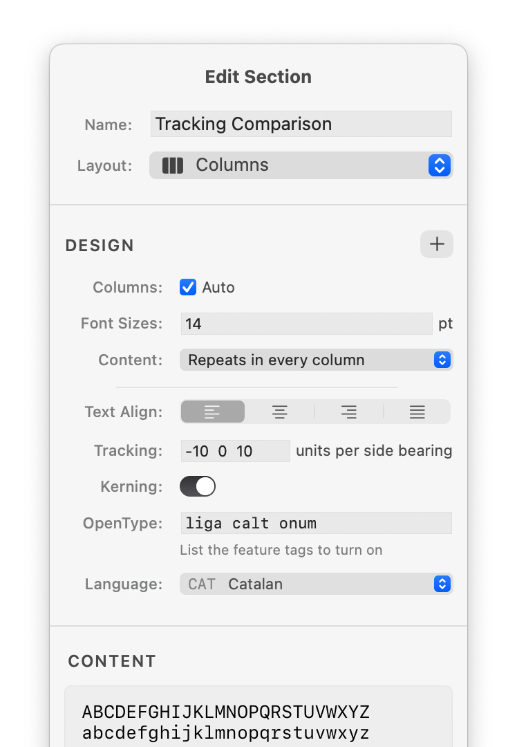
In the short term, however, I’m prioritizing other features that are more vital to type designers. A product roadmap is very much a design challenge, and I’ve charted a path to arrive at an interface like the one shown below.

Iconography
Iconography is one of my favorite areas of visual design. Much like a letterform, an icon is a microcosm of the same considerations at play in larger designs.
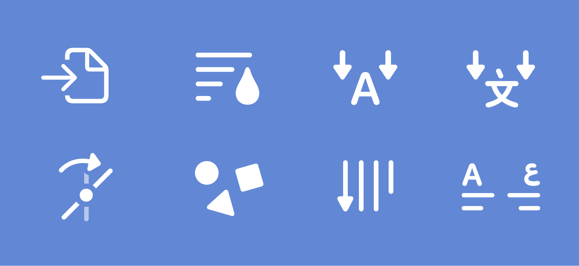
A core goal of Font Proofer’s UX is to feel familiar and utilitarian—not to call attention to itself—so the icons needed to be obvious, distinguishable, and unremarkable.
Extending Apple’s SF Symbols icon library, I created custom UI icons for specialized typographic and layout features. These icons adapt to different font weights, optical sizes, and locales.

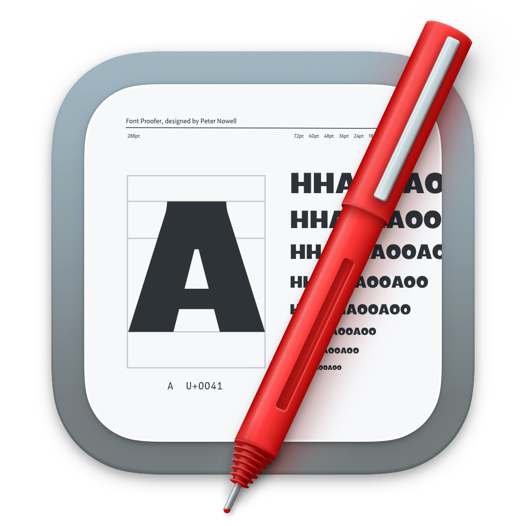
The app icon features the ubiquitous red pen that designers use to annotate proof documents (physically or digitally).
In a future version, the app icon will be dynamic—showing a user-customizable letter in the font they’re currently proofing. I have a working prototype!
Software Development
Resolved to make Font Proofer a reality, I learned 2 programming languages: Python and Swift. Although I’d been building websites for a decade, I’d never made a native app. It was simultaneously terrifying and exhilarating.
One engineering feat I’m proud of is the integration with 3rd-party font creation software like Glyphs and RoboFont. One of Font Proofer’s most beloved features is the ability to test the fonts you’re working on in those other tools. No need to export and install.
But separate apps are isolated, and can’t access what others are doing. To bridge the gap, I built lightweight “companion” plugins for Glyphs and RoboFont that communicate with the Font Proofer app. The concept is simple but the engineering was shockingly complex.
The resulting user experience, partially demonstrated below, is effortless and magical. Designers find themselves proofing more often—leading to better typefaces in less time.
The Swift logo is a trademark of Apple Inc.
Graphic & Web Design
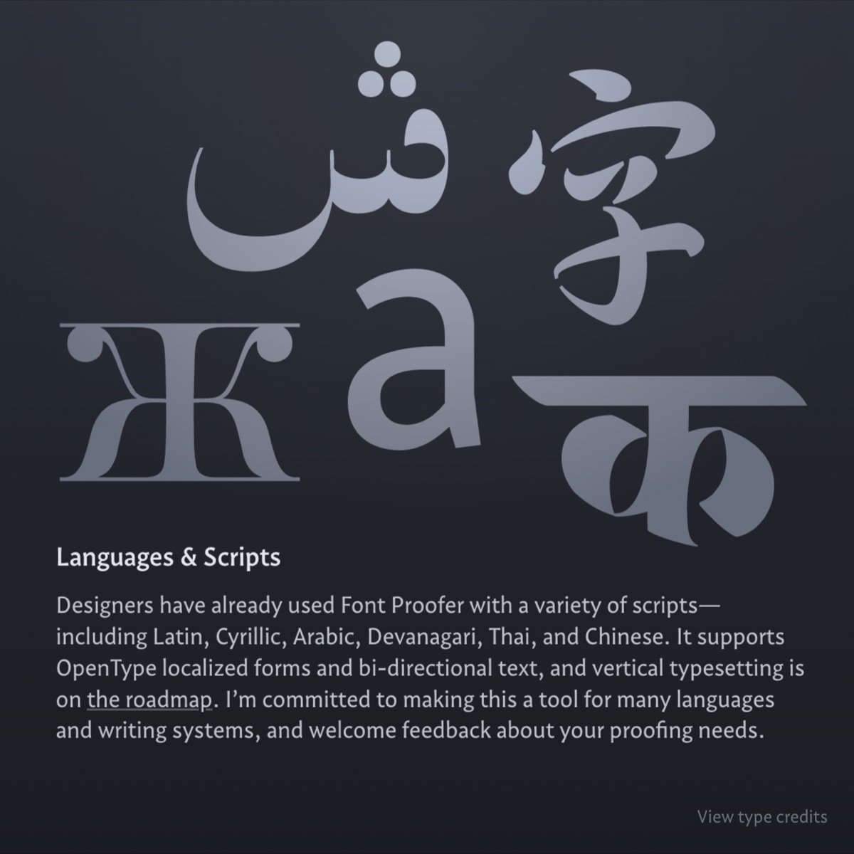
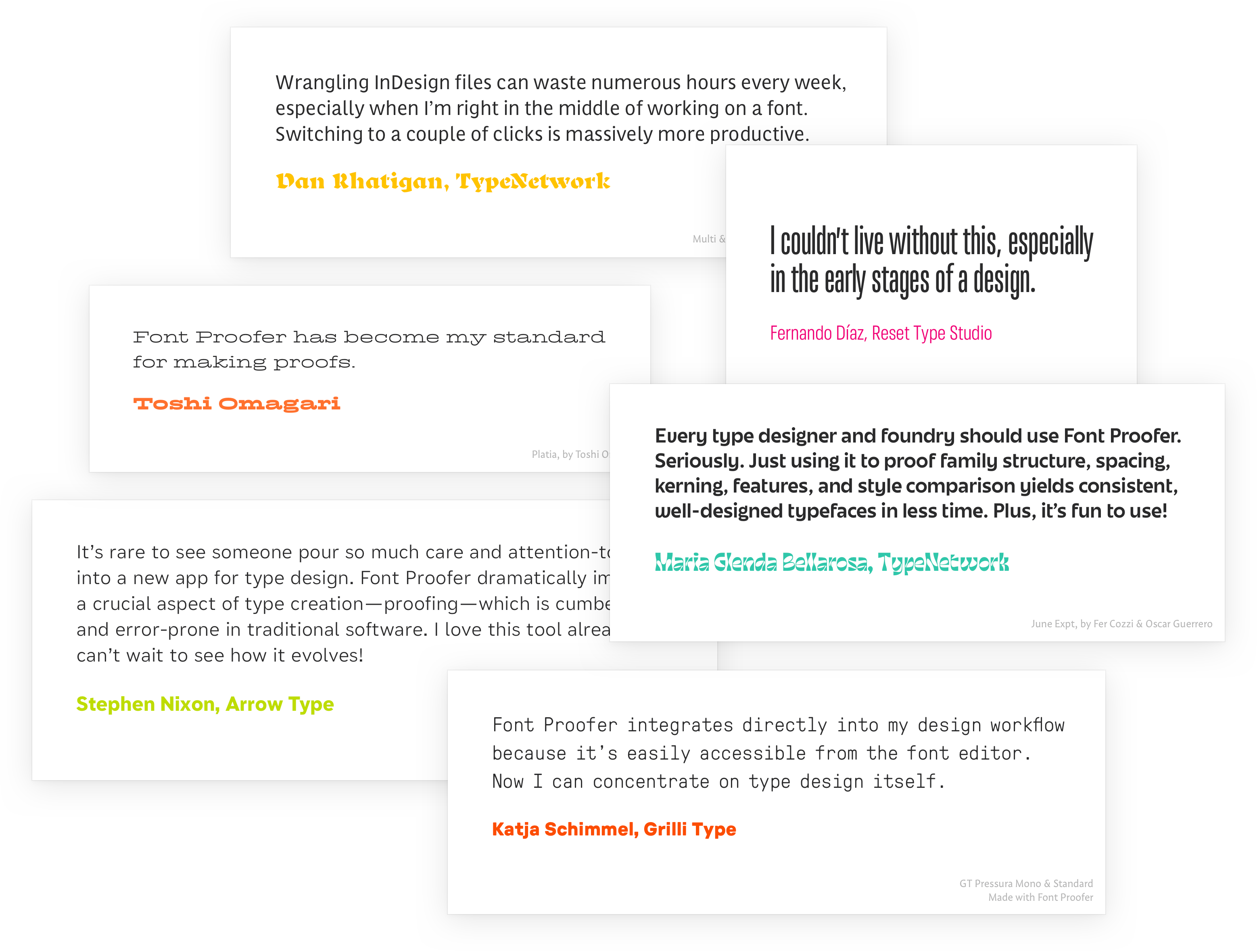
Font Proofer’s website celebrates the vibrance and diversity of typefaces made by its users. Nearly all were designed by women and people of color.
It’s inherently tricky to depict a tool whose main features have no UI—features that automate the tedious tasks you no longer need to do!
One solution was to let customers describe how each feature impacts their work. These testimonials are formatted in the designer’s own typeface—their visual voice.
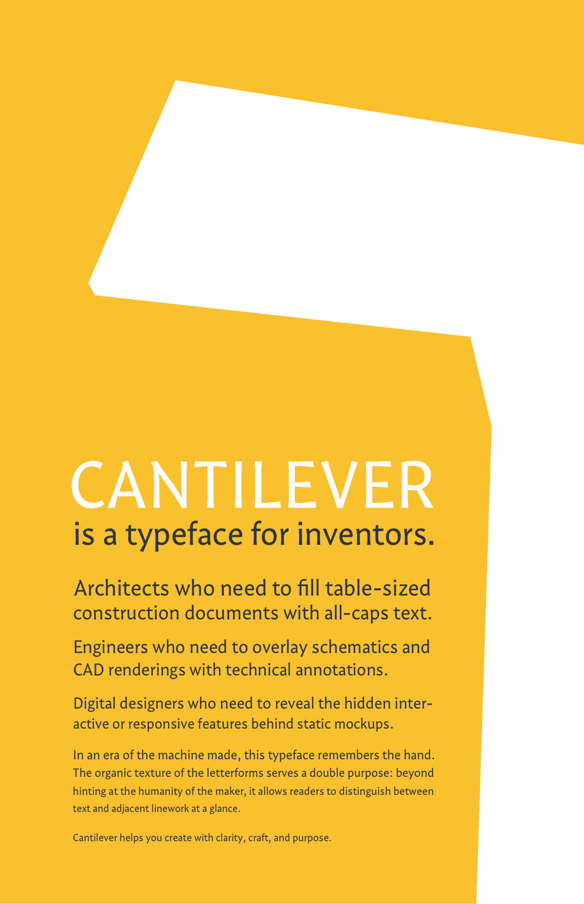
For paragraphs and captions I used my own typeface, Cantilever.
It’s fitting that the typeface that inspired me to create Font Proofer would become part of the tool’s identity. Cantilever reflects my values of clarity, craft, and a human touch.
Training & Resources
Great learning resources are often overlooked, but I believe they are absolutely part of the design. A great UX isn’t a substitute—it’s a solid foundation.
Leveraging nearly a decade of experience writing technical articles, leading design workshops, and creating the Sketch Master courses, I launched Font Proofer with plentiful documentation and tutorials. There are astonishingly few resources online about proofing type, and I intend to change that!
Check out the tutorials and learning resources website here.
Interested in working together on a project?