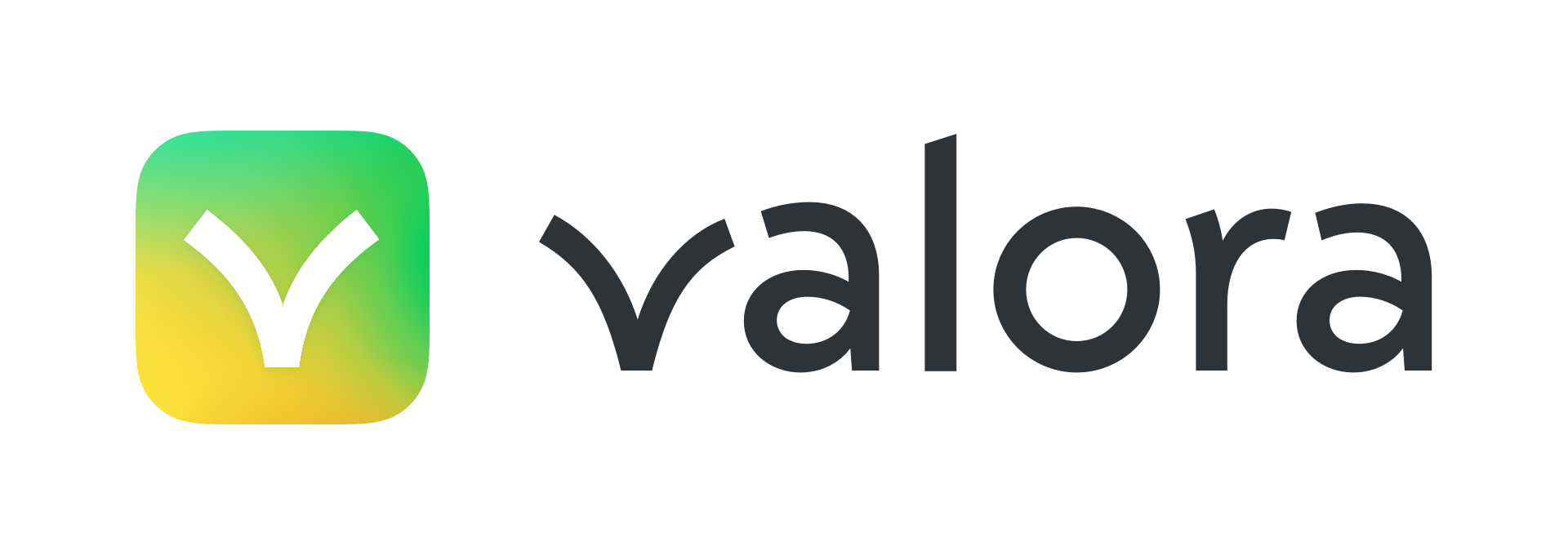
Valora
App Icon & Logo
The client, Celo, is an environmentally- and socially-conscious cryptocurrency blockchain. After refining Celo’s own logo a year prior, they asked me to create a logo and app icon for their new project: Valora, a digital wallet for Celo currencies.
Putting visual form to a product/company’s values and personality is always a balancing act—often between opposing signals. Because Valora handles people’s money, its visual identity needed to convey stability, security, and dependability, while still feeling enthusiastic and approachable. It also needed to appear distinctive yet related to Celo.
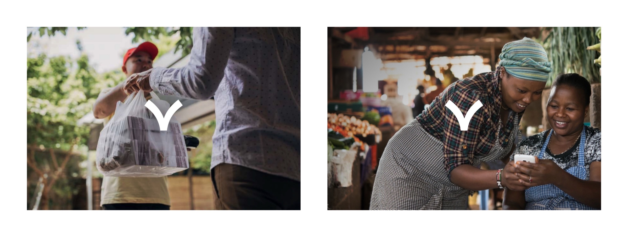
Valora’s logo needed to feel distictive yet related to Celo.
The most obvious solution was to differentiate Valora through its app icon, while using the same geometric sans-serif lettering style as “celo”. But the word “valora” turned out to be much too sharp and cold when rendered in that style.
I loved the app’s fun illustrations by Celo’s lead designer, Taylor Lahey—especially the “bouncing coin” symbolizing money moving between people.
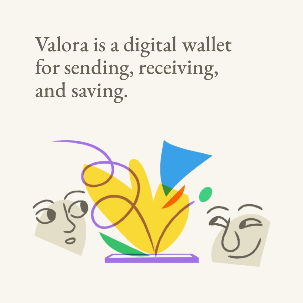
Illustration in the Valora app, by Celo designer Taylor Lahey.

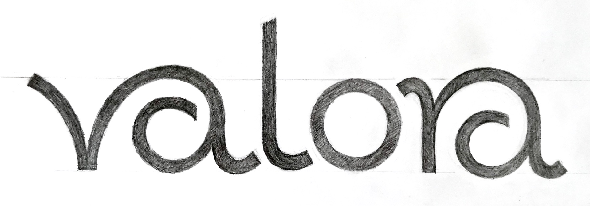
A sketch of mine. A bouncing coin; a letter v.
So I began to explore the intersection of cursive scripts and sans serifs… which inspired the following sketch.
To ensure the letters were recognizable to Valora’s users around the world, I also explored separating the letters and pursuing a more conventional letter a.
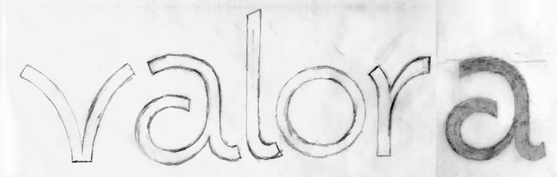
We iteratively turned down the volume on the flowing-script style, fine tuning every detail (letter shapes, spacing, weight) to articulate the right attitude for Valora: approachable and exciting yet sturdy and reliable.
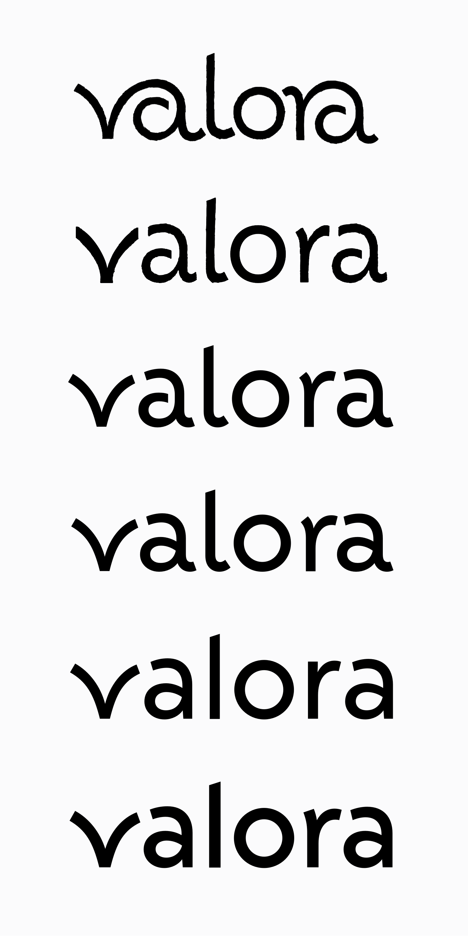
The final version (bottom) still hints at movement while remaining sturdy. It also appears related to the “celo” logo, while branching-off stylistically to be its own thing. That was important when Celo graduated Valora into a separate company shortly after launch.
I designed the app icon and logotype simultaneously. The “bouncing” letter v was so full of meaning for the client that it was an obvious theme for the app icon. But how to translate it into an icon was far from obvious.
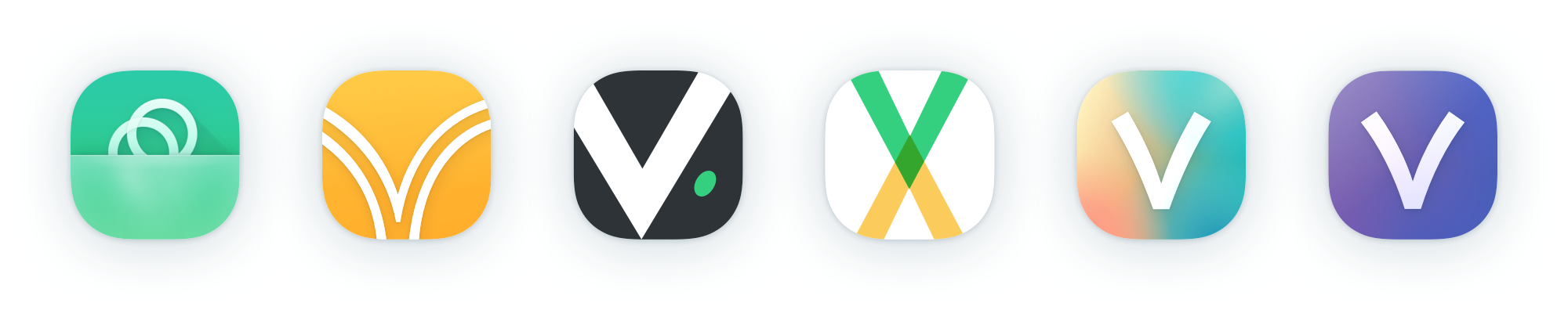
A few of the unused preliminary concepts for the app icon.
While iterating on the script-style logotype, it seemed we’d found an iconic v shape that referenced the bouncing coin and was legible at small sizes.
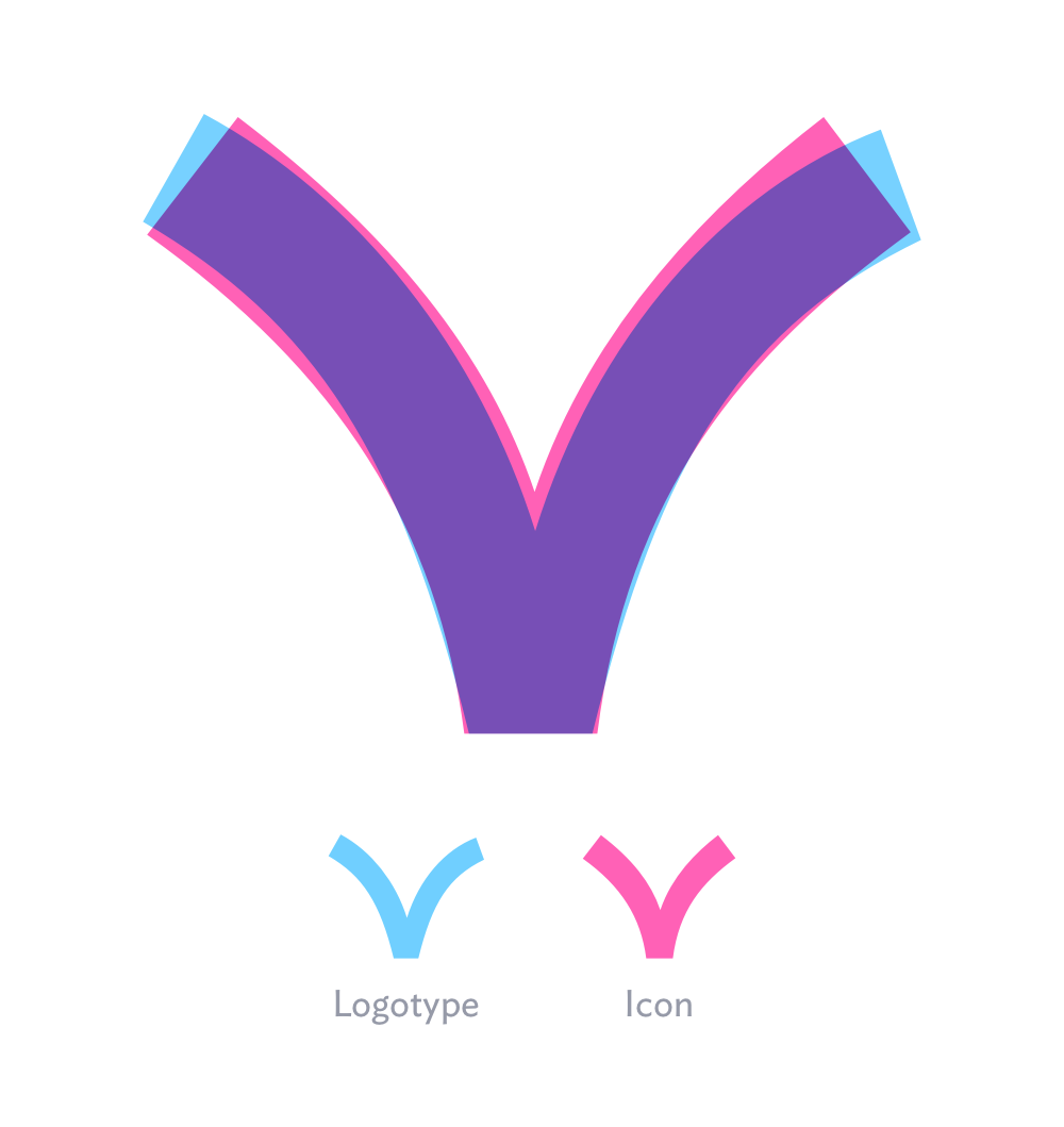
The letter v in the app icon is different, but designed to feel the same. The logotype’s v is thinner and asymmetrical, bending to join with the next letter.
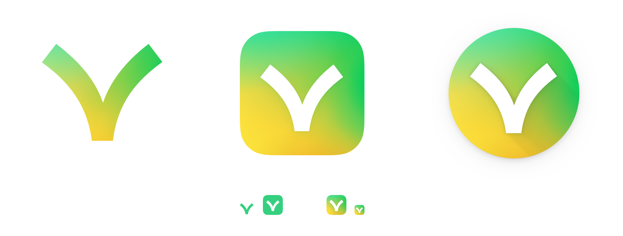
I created a variable font with adjustable weight and curviness—allowing the client and I to find the right balance together.
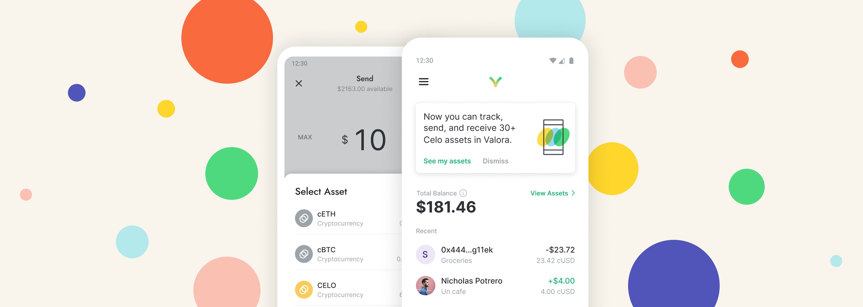
Following design guidelines for each platform, the iOS version of the app icon was mostly flat, while the Android version featured lighting effects and subtle “long shadows.” The Android version also had multiple layers, allowing a device’s app launcher to offer interactive animations.

The final icon has variants for different contexts and platforms—including iOS, Android, monochrome, and micro-size.
The icon and logotype can be used individually or together.
After delivering the logo and app icon to the client, Valora’s designers took the baton and created brilliant work in the app and marketing materials.
They even had someone animate the logo for a promotional video. I love how it reinforces the original bouncing coin inspiration.
Interested in working together on a project?